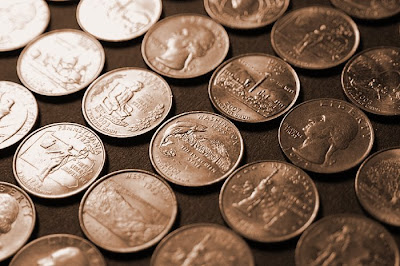
I tried a few variations on this shot, at first thinking it would look good as an extreme close-up but backing off a bit seems to work better as it gives the light a chance to go from bright to dark across the image. Then just to give it a little more mood, I messed with the color a bit in Photoshop. 1/320th sec. f/4.5 iso 800

Enjoying your blog. Wondering about your ranking/choice buttons on the bottom of the post. How'd you do that?
ReplyDeleteI never would have thought of you as a two-bit photographer.
ReplyDeleteI like it - and the color you chose makes it look as though from a different age. Interesting how the coins change lighting, but the background doesn't nearly as much.
Ditto on the checkboxes?
Great picture. Reminds me of the paintings by Lisa Milroy.
ReplyDeleteThanks for you comments. The buttons on the bottom of my post came from the Layout screen where you can change different parts of the layout, add gadgets, etc... Click the "edit" link for "Blog Posts" and you'll see it in there.
ReplyDeleteHa! Eric, what a funny guy (how come funny is only worth 0?)
ReplyDeleteTim,
ReplyDeletethank you for sharing your setup in the layout feature, I went looking for it and could only find the voting, so I added that to my blog.
They're all just counting how many people voted - when you looked at "Funny" no one had chosen it, so it said "0".
ReplyDelete